On Leaving Chicago
My family and I are leaving Chicago. I’d like to explain.
It’s simple: my incredible wife has been given a career opportunity that would be silly to let pass. The details aren’t really important. What is important is that the kids and I would do just about anything to support this woman. She’s on a rocket ship and we’re wired in at mission control.
For those of you who know me, this may come as a bit of a shock. More than a few of the few of you I have delivered this news to in person have expressed that you never thought I would leave Chicago. Well, I never thought I would either. I love this town to my core. I have written about that love over and over, went to work for the City of Chicago to try to make things better, and I’ve helped raise a family here.
But sometimes things change — and you never know what will happen. Back in 2000 when my wife and I were both working in Atlanta — newlywed, post-grad school, the very definition of unencumbered DINKs — unforeseen change also reared up. My wife’s company was being acquired and she was needed in Chicago. Honestly I was a bit worried. Chicago in 2000 was no tech mecca, especially compared to go-go late-90’s Atlanta. I specifically remember a BusinessWeek cover story from that year called “Chicago Blues” about how the town had lost its economic mojo. What, was I going to work for an agribusiness or something?
Obviously we did move and obviously things turned out very positively over the course of the next 16 years. Chicago’s tech bubble burst and then the scene reconstituted itself stronger than ever. I am the happy beneficiary of a move I initially did not want to make.
Oh, right: we’re moving to Denver. It’s gorgeous. It’s thriving. And, while I admit that Denver wasn’t ever on a short short list of cities I’d move to in a heartbeat, after a few visits I have no doubt it’ll be a great place to live.
So much more to say — even more left to do — before we depart this summer. Let’s not be strangers, now or in the future.
Shaping the tools
Pretty honored to be recognized by Newcity as one of Chicago’s “Design 50”. It’s quite a list to be on.
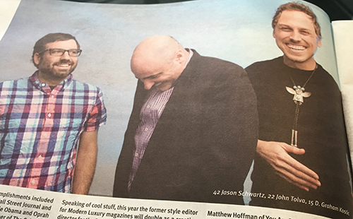
Photo by Joe Mazza
Here’s the accompanying write-up:
Some designers on this list design furniture, some the buildings the furniture goes inside of, and still others the blocks and developments we put those buildings in. John Tolva goes one better with his latest endeavor, designing the algorithms and systems behind the tools of urban planning. The one-time “data czar” for the City of Chicago has moved on to the private sector where he has been applying his data wizardry and impressive computer science chops in the development of urban planning and visualization technology. As Marshall McLuhan said, “We become what we behold. We shape our tools and then our tools shape us.” John Tolva is the man shaping the tools.
Here’s the full list.
I made the list in 2014 too and it contained one of the most unintentionally doleful photos I think anyone has ever taken of me. Glad the photo from this year (above) is the other end of the emotional spectrum.
Thanks, Newcity!
How to dump accelerant on the Great Chicago Fire Festival
The reports say there were 30,000 people hugging the Chicago River between State and Columbus last night to witness the first ever Great Chicago Fire Festival. That’s a low count and it doesn’t capture at all the sense of anticipation and excitement that suffused the crowd — something I cannot ever remember witnessing in the Loop proper on a (chilly) Saturday night. People were ready and proud to be part of a great spectacle.
This did not happen. Most of the morning-after reviews cite technical glitches in actually getting the floating set pieces to ignite. Social media, of course, was less kind — and funnier — dubbing the event “The Great Chicago Smolder Festival”.
I was disappointed. It’s not easy to haul a family of five into the welter of downtown on a Saturday night. But like everyone else, we had high hopes.
And I still have high hopes. I’m not giving up on this festival — and I hope the City, Redmoon, and the funders behind the event don’t give up either. I want to be excited to take my family to the Loop. I want to celebrate our history with tens of thousands of fellow Chicagoans. I want to see the the river blaze.
Here are a few suggestions on how to make this happen.
- Make the spectacle move. Chicago is good at parades. Really good. Why not treat the spectacle on the river as a parade? Not just the floating choir (which was fantastic) and the kayaks, but all the showpieces. There’s no perfect vantage point on the river, especially with its bend at Wabash, but there’s no perfect vantage at a street parade. This is why it moves.
- Use the cityscape. The buildings, bridges and embankment along the river are ripe to be used as part of the show. Many more people can see them than can see the surface of the river. They are tableaux ready to be illuminated, projected onto, or used as screens showing the current action. (Sydney, Australia has this figured out perfectly in its Vivid Festival.) Let’s not let the garish Trump sign be the only thing we see when we look up from the waterway.
- Shut down Upper Wacker Drive. Obviously the City underestimated the turnout, but that’s a good problem to have. In the future, use Upper Wacker as a pedestrian zone. More room to move along the river, more food truck and vendor stall space, more of a street festival atmosphere. Traffic can be conveniently re-routed to Lower Wacker.
- Establish better viewing infrastructure. At Mardi Gras New Orleans lines Canal Street with bleachers. Some version of this is needed along the river for future fire fests. Very few people not in the first row at any given vantage could see anything except others’ glowing smartphone screens held up in the air. And with people scrambling and dangling all over the embankment infrastructure last night this is as much a safety issue as it is convenience. The new riverwalk will help with viewing, no doubt, but there still needs to be smart planning.
- Less pandering prologue. More spectacle. I get that you have to thank sponsors, but the narration at the show’s beginning delayed and defused much of the crowd’s excitement. And if you are going to make shout-outs, let’s not get carried away with the politicians and city staffers. The show is for regular Chicagoans. At the very least start the show with a bang and then chatter away for a bit.
- Remember that the larger the stage the less nuanced you can be in your storytelling. I love all the little nods to Chicago history embedded in last night’s event. It’s great to learn about this in promotional material. But the actual event — which is not intimate like a theater — is not the place to be subtle. Go big or we’ll go home.
- All the flaming things. Let’s be honest with ourselves here. It was not Chicago history or fireworks or the promise of food trucks that brought all these people downtown. It was fire. A great floating conflagration (with explosions!) was the real thrill we sought. I understand there were technical problems, but my sense is that even if the three buildings had burnt in unison they would not have blazed as mightily as people wanted. The river canyon is all about verticality. Next year we need flames several stories high.
So let’s treat this one as a dress rehearsal, come back next year, and really create an inferno.
Intersections in space and time
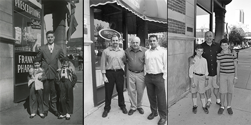
Sometime in the late 1940’s my grandfather, Eddie Tolva, took his two sons — my father and uncle — to the corner of Dakin Street and Sheridan Road and someone snapped a photo. Just three blocks north of the Wrigley Field scoreboard and nestled between a cemetery and a westward jog in what is now the CTA Red Line elevated tracks, this was the corner of the sleepy little street that my dad grew up on.
When I first moved back to Chicago in 2000 I spent a considerable amount of time trying to find the location of this photo. I knew the neighborhood generally (what is now known as Buena Park, part of Uptown), so I just rode my bike looking for the few architectural elements contained in the photo. Eventually I found the building — 3936 N. Sheridan — and, in 2003, got my brother and father together to re-enact the shot. What was once Franklin Pharmacy was then Emerald City Coffee. The proprietors told us that the corner shop had been many things over the years including a pet shop and a porn store.
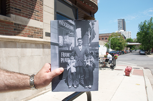
A few years later I returned with a friend to try my hand at the photo-in-the-real-world perspectival trick (part of the fun “Looking Into The Past” Flickr group).
This past weekend I took my family back to the corner, completing a three-generation sort of family placemaking. Here’s a larger version of the triptych I put together. (And the complete album.)
There’s a plaque on the masonry of the building right at the spot of the photo which reads “On this spot in 1897 nothing happened.” Who knows who or why this location was chosen for the pseudo-historical marker, but I do enjoy the irony that this particularly meaningful spot in my family history is demarcated by a sign like that.
The building itself may not be there much longer. Its owner wants to raze it for an 8-story transit-oriented residential complex. But the corner will always be there, my family’s little locus of reference in the middle of an ever-changing city.
The natural proprietors of the street
A while back Iker Gil of Mas Context asked to interview me for an issue of his magazine focused on the topic of surveillance. The angle was to present data, especially urban data, through the lens of “tracing, archiving, control, camouflage, deletion and monitoring”. The topic was very relevant, given what we know about the NSA and PRISM, but something about the issue’s sole focus on deliberate subterfuge and power imbalance rubbed me the wrong way. I noted to Iker:
“[S]urveillance” is a word fraught with bias towards the act of looking, covertly. What’s going on is much more than that: sensing of all the vital signs of the environment, not just looking at people or their data. That may be what you intend, but it is a partial and distorted picture of the value of instrumented cities. It does not imply any of the benefits of bus trackers, or dynamic tolling, or bridge traction coefficients for warming or any of the other myriad ways the Internet of Things makes our lives better.
Iker was interested in speaking with me based on my advocacy of — and work towards — platforms of public data collection and sharing. I agreed to be part of the issue mostly because I wanted to make the case that there’s nothing inherently nefarious about city data. There’s a line between observation and surveillance — and it needs to be well-limned. Sensible, adaptable urbanism is based on thoughtful observation. Mas Context chose to go with surveillance, which is useful: knowing what’s on the other side of the line is important in being able to draw it accurately.
The full piece is available here.
Cities teem with data because they teem with people using the city. Records of its use — from historical real estate deeds to real-time pedestrian-counting — is data collection. Naturally, news organizations, community groups, activists, and municipal governments have been collecting it for a very long time.
But that’s not the important point. What matters is how it is collected and shared. Collective observation is achieved — and surveillance defused — when the following goals are achieved:
- individual privacy is protected
- the act of data collection is fully transparent
- all collected data is made available openly, free of charge, and in formats that are useful
Drop the ball on any one of these and you have what can rightly be called surveillance. Nail all three and you get what Jane Jacobs called “eyes upon the street, eyes belonging to those we might call the natural proprietors of the street.”
It’s that second clause — who the eyes belong to — that’s the critical difference. Being looked at (and perhaps not even knowing it) versus doing the looking yourself.
Healthy neighborhoods are those that feel observed (and hence engaged) by its residents. Safe roads are those where everyone — motorists, cyclists, and pedestrians — is equally vigilant. Smart cities are those where people are in the know, period. This can come from a mix of their own observation, a diligent local press (and blogging) corps, and, yes, data that is published about their world collected with notification, openly, and with utmost respect for privacy.
Healthy urban experience depends on eyes upon the street. Let’s make sure those eyes are ours.
City of Big Data
Newcity has published an edited transcript of a conversation I had with writer Phil Barash about design, data, and urban systems. It’s a lotta words, but does, in a way, capture more fully my thinking on data-informed urban design than anything that’s previously been published. So I’m glad for that.
Here’s the full piece: Bright Lights, Big Data: How the Hog Butcher became the Data Cruncher.
The story is timed to coincide with the opening of the Chicago Architecture Foundation’s City of Big Data exhibit. If you live in Chicago — or are visiting (the CAF architecture river cruise is the most popular thing to do in the city) — you really should check it out. Answer questions such as: What does information architecture have to do with the built environment? How did the fire of 1871 kick off Chicago’s obsession with urban data? And, just what in the hell does Carl Sandburg have to do with big data?
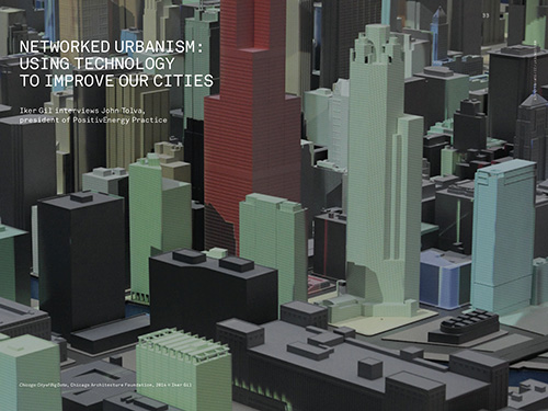
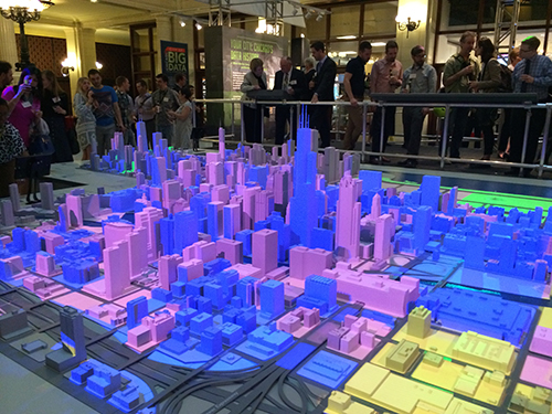
Bonus: it features a 3D-printed monochrome cityscape used as a “canvas” on which data visualization is projected. Spectacular, immediate, and physical.
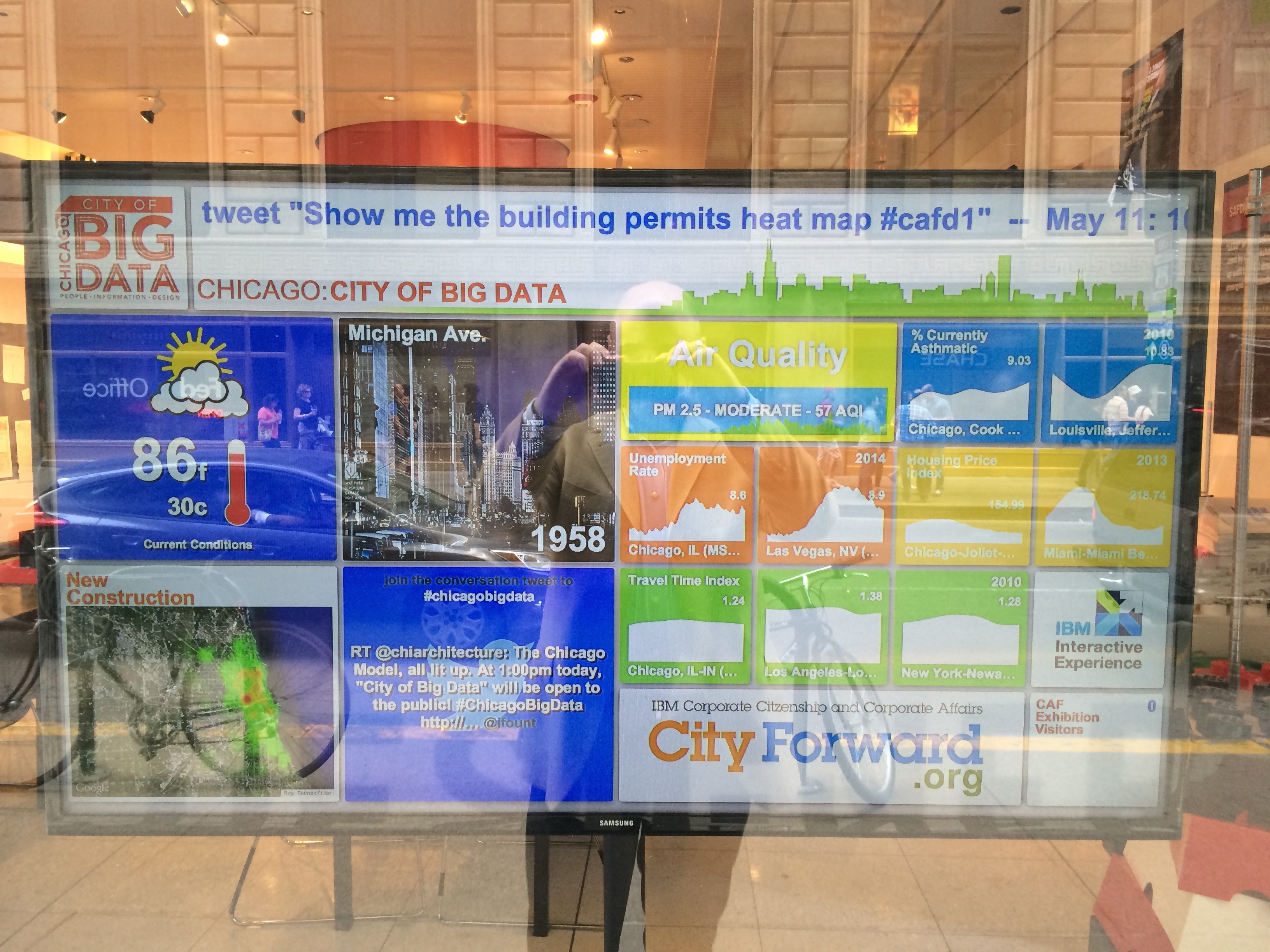
The exhibit also features a custom dashboard of city vital signs, developed by my old IBM City Forward team. Two special panels face Michigan and Jackson for data-flâneurs and other passersby.
Optional caption of above photo: self-portrait with all professional pursuits to date, 2014.
Chicago’s Design 50
Photo by Joe Mazza
Despite the portrait of me in the piece (possibly the most unintentionally sad snap ever), I am very honored to be included in this list of designers in Chicago. Happier still that the definition of designer seems to be expanding.
Here’s the full article.
10,000
I’m coming up on my tenth anniversary as a Flickr user and just posted my 10,000th photo. Actually it is not a photo but a short clip of the CTA Holiday Train rolling in to Belmont station on the Purple Line. I’m especially pleased with a fairly useful application of the iPhone 5S slow-motion video: though the train is coming in quickly, you get to see St. Nick nice and clear.
Flickr has been through the ringer in the last few years. Yahoo has not been kind. And the changes since Marissa Mayer has taken over, while positive in that Flickr is getting attention, leave me scratching my head a bit. Yet, Flickr contains the memories of my last decade and I still don’t know of another service that offers the kind of tools that the site does. I’ll be with Flickr until the end — mine or its. (Backing up frequently of course).
What the public way means in the networked age
Let’s start here. I want our relationship with public objects to feel like this.
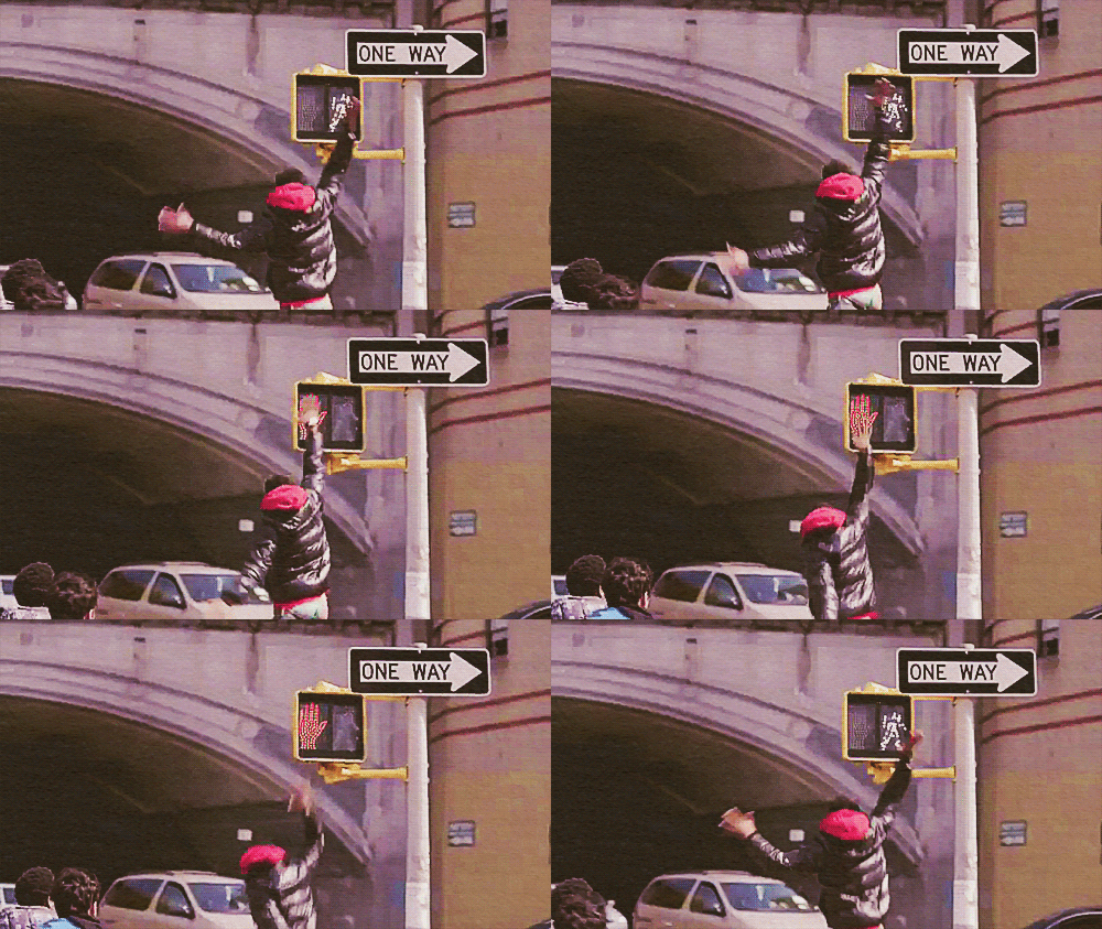
It does not feel like this currently.
But let’s back up to a street scene in Chicago in the late 1930’s for context.
You’re walking at a clip downtown because it’s storming. You hunch over and tilt your umbrella into the sheeting rain as people scamper for cover and taxis. Luckily your destination is this building and you know, thanks to having walked this route before (and a clever architect), that you don’t even have to look up to figure out that you’ve arrived.
On both the Clark and LaSalle sides of the Field Building (as it was originally known) are symbols in the sidewalk pointing to the entrances. F for Field, arrows for which way to turn.

If noticed at all, these small, plain sidewalk icons could easily be mistaken for architectural decoration. But they were designed specifically around the umbrella use-case.
You may also have seen compass markings in the sidewalk just as you step out of a subway stop. Easy to overlook, but incredibly useful if you’re disoriented emerging onto the surface grid.
These examples represent embedded, passive information that’s not screaming for attention but placed precisely where you might need it. It’s information design in the physical architecture of the public way.
Today there’s a new usage scenario. You’ve seen it a thousand times. Urban pedestrians staring down at their smartphones, half-in and half-out of the moment in what Amber Case calls “temporarily negotiated private space”.
Maybe the F-marks would be missed by these otherwise engrossed city-goers, but they are a great example of ambient information in city environments. And we’re going to need a lot more of that as we increasingly negotiate our public space through a mixture of physical and digital awareness.
What’s new is the sheer volume of mobile, networked technology in our public spaces (and everywhere else). It’s an opportunity to “embed” information in new ways and to customize it to very specific places and moments in time.
Typically sensors and wireless connectivity claim the spotlight in discussions of the networked city, but I’d argue we’re missing a real opportunity not to use new technology to make the built environment more legible.
Why?
Most obviously, embedded digital information can aid in safety. The video of the girl in China on the phone falling through the sidewalk is one end of a spectrum of examples, most of which are instances of obliviously texting pedestrians falling off piers, walking into traffic, or smashing into one another. And it’s probably getting worse.
Rudimentary systems that might prevent such calamity do exist, but with a focus on motorist, rather than pedestrian, alertness at crosswalks. Crosswalks and Xwalk both flash lights to make the zebra stripes more prominent. You could imagine a more nuanced system which assumes pedestrians are looking down (at their devices) and flashes or changes color when the traffic signal is about to turn green. Interaction with devices via Bluetooth or NFC is not inconceivable either. Scenario: if the device is engaged in use, assume distraction, and alert accordingly. A responsive public way that’s in a positive feedback loop with its users.
Accessibility is another category of use for the responsive public way. Crosswalk design for the visually-impaired is not a problem for individual intersections — high-pitched chirping signals — but it doesn’t scale for large cities. The cacophony of a city full of bleating traffic signals would be the kind of noise pollution that causes New York City to impose fines on honking motorists. But if the crosswalk itself was open to digital development you could imagine white canes, phones or other personal devices alerting the visually-impaired pedestrian that the street was open to cross.
Basic convenience may be an even better rationale for a legible (and writable) public way. Why perform a digital transaction at a modern-day parking meter when you can text it or use an app to pay before leaving your car? Think driving snowstorm. Think having three kids in the backseat and the meter is 100 meters away. Think not having a credit card at all. All good reasons. This is getting closer to the high-five moment of a digital public way.
If we begin to think of a truly responsive public way we have to rethink what “public” means in the digital age. The analogy here is a city’s information. Getting at a city’s vital signs and the records of public servants has been a long slog for transparency advocates. In the days of exclusively paper-based record-keeping Freedom of Information legislation was one of the only ways to do anything with public records. Then came digitization and the same barriers obtained. You had to go through legal maneuvers to get at it — and even then it was not particularly useful beyond reading it. PDF’s largely made this information static, opaque to computer-aided parsing and tabulation. But the advent of machine-readable online document standards and a shifting political climate towards the value of open government has unlocked torrents of data in cities around the world. What’s come of this can only be described as a new kind of civic engagement: open data has bred an ecosystem of secondary applications, analysis, and interactions that governments could never conceive of, much less produce themselves.
The infrastructure and objects of our current public way are in their paper period.
Certainly, there are screens scattered throughout. Public transit leads the way here. Buses that generate location data, subway platforms that announce arrival times, etc. There’s some digital marketing along the way that occasionally serves up alerts or public service announcements. And every so often you’ll see an advertiser attempt something (barely) interactive — a QR code for more information, typically. But there’s no platform in the software and open data API sense of the word in the physical city.
And yet, many of our public objects are networked — the foundational requirement for a responsive system. Public bikes and bike stations, bus shelters, parking meters, and of course every light pole with a public access point clamped to it — all these things are network endpoints. But they’re not interconnected and they are not open to interaction. There’s no interface for third-party development.
Some City of Chicago Department of Transportation construction projects feature NFC and QR codes on signage onsite that link to information about the project. That’s the paper stage, incunabula. The vision is for direct access to mobile-optimized applications for business permits in situ. More promisingly, the information system underlying the upcoming roll-out of public bike sharing in Chicago (e.g., real-time bike availability info) has an open API. 4,000 bikes and 400 stations will be open to development and interaction in the way that the city’s open data portal is. A step away from paper towards platform.
There’s an inverse to this dynamic, equally ripe with opportunity. The impact of city-dwellers’ use of digital technology when out-and-about has yet to make a any real impact on physical urban design. Mayor Nutter of Philadelphia got a good laugh last year when he released an April Fools Day video touting newly-striped “texting lanes” on sidewalks. But that was parody (though thinking about it a little longer makes it slightly less parodic).
Surpassingly few cities and urban design firms actually give thought to how technology is changing the way the city is used. Which is odd, since so many of the problems that online companies grapple with — what it takes to create a vibrant, safe public space, as one example — have pretty well been solved, if not perfected in implementation. There’s the Facebook approach, which is essentially suburbia: a gated network of affinity that disallows chance encounter and serendipity. And there’s the Twitter approach which is all about non-reciprocal engagement and diversity. (It’s no coincidence that the founder of Twitter is a dilettante urbanist.) This is a choice between mall culture and real urbanism and I fear that our information architects and built environment architects have not even begun the conversation.
The sidewalk is the original social network and its lessons have much to teach the designers of our digital overlay of public spaces.
In Chicago, it’s coming together: a robust open government community of engaged developers (and increasingly savvy residents) fueled by an administration actively publishing data and working to make sure the vendors of our public objects treat it as a platform. There’s a long way to go, but we’ve etched some symbols in the pavement and we’re hoping you follow our lead.
High five!
(X * X = Chicago). Solve for X.
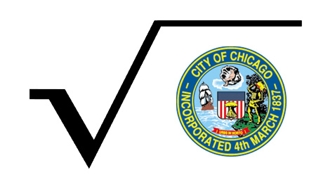
Recently, as we sometimes do to fill time, my family and I were asking each other trivia questions. My six-year-old daughter piped up with one from left field that made me laugh out loud — then had us thinking for the rest of the evening. She asked:
What’s the square root of Chicago?
Didn’t have an answer for that one, but it was ready-made for my Twitter followers and they did not disappoint.
The literalists looked at ranking and square mileage, but perhaps this town if squared might be us:
@immerito it’s Sunbury, North Carolina population 1,645
— Zach Kaplan (@zkaplan) February 17, 2013
Some took a geographic angle. Logan Square, the Loop itself and my favorite:
@immerito Fort Dearborn. It was a square. Planted the roots of our city. twitter.com/tomkompare/sta…
— tom kompare (@tomkompare) February 18, 2013
The most interesting approach was formulated by Seth Lavin. He put it two ways:
For the verbal minds, it’s whatever makes this sentence true: “In Chicago, we blank blank.” (e.g. we reform reform)
In other words, (X * X = Chicago). Solve for X?
It’s a head-scratching formulation, in some ways. What thing, what action, what verb does Chicago do to the same thing, action, verb that makes this city uniquely us?
Some suggestions:
- defeat defeat
- discriminating discriminators
- perfect perfection
- disempower disempowerment
- build buildings
- plant plants
- bully bullies
- reform reform
- red line (huh?)
No clear winner to my mind, but I sure did like Josh Davison’s wordplay: “polish Polish”. As in polish off Polish sausage. My wife noted that the reverse has been historically true with Polish housekeepers being employed to polish things (among other tasks).
All good fun, of course, but this exercise may be an epiphenonemon of the very real debate over whether cities can be mathematically described in a useful way. That’s quite another post. For now let’s revel in the oddball question of a six-year-old kid.

