What it’s like to match wits with a supercomputer
I spent most of the May 1997 rematch between chess world champion Garry Kasparov and IBM’s Deep Blue supercomputer sitting in a grad school classroom. I think it was Intro to Human-Computer Interaction, ironically enough. The professor projected a clunky Java-powered chess board “webcast” (the term was new, as was the web) so we could follow the match. The pace of chess being deliberative and glacial, it really wasn’t a distraction. Not to mention that, at the time, I didn’t know how to play chess. But I do remember people caring deeply about the outcome. I went to work for IBM the following year.
Deep Blue’s descendant, if not in code or microchips then in the style of its coming-out party, is Watson, a massively parallel assemblage of Power 7 processors and natural language-parsing algorithms. Watson, if you’re not a geek or a game show enthusiast, was the computer that played Ken Jennings and Brad Rutter on Jeopardy Feb. 14-16 of this year. Watson won.
Wednesday of last week I got a chance to play Watson on the Jeopardy set built at our research facility for the show. I did not win.
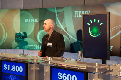
But I did hold the lead for a time and, in fact, I beat Watson during an unrecorded practice round. Honest!
Jeffrey Plaut of Global Strategy and I were the two human competitors selected to go up against Watson in a demonstration match. We did so at the culmination of a few hours of discussion with leaders from the humanitarian sector on how to expand Watson’s repertoire to put it to work in areas that matter. (More on that in a bit.)
IBM built a complete Jeopardy set for the actual televised match. Sony has lots of experience with this, as Jeopardy often goes on the road. But it’s clearly a hack: TV made the set look a lot bigger that it really is and the show’s producers had to jump through hoops to provide dressing room space and keep the contestants segregated from interacting with IBM’ers (to avoid claims of collusion, I suppose). Ken Jennings has some typically humorous insight on this.
Trebek was long gone, so we had the project manager for Watson host the session I competed in. He’s actually very good, as Watson went through a year of training with past winners and stand-in hosts. I was to play one round of Jeopardy. The rules were the same as the real game and Watson was at full computing capacity, with two exceptions. We were told that we could ring in and then appeal to the audience for help and, most importantly, Watson’s ring-in time was slowed down by a quarter second. The first I took as an insult — if I was going to compete against a computer I was going to do it myself — the second was a blessing.
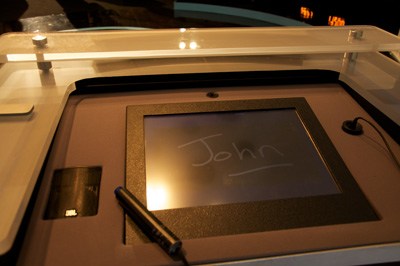
Standing at the podium is certainly nerve-wracking. There’s a small screen and light pen for scrawling your name and then the buzzer. I stood in Jennings’ spot and it was striking to see how worn the paint was on the buzzer. From sweat? Who knows, but that thing looked like it had been squeezed to death. Contestants can see the clue board and the host, of course, but there’s also a blue bar of light underneath the clues which is triggered manually by a producer once the host finishes reading the last syllable of the clue. This is the most important moment, as ringing in before the blue bar appears locks you out temporarily. Watson had to wait a quarter second at this point and I am convinced it is the only reason we humans were able to get an answer in edgewise.
In a way, this moment is as much human-versus-human as anything. You’re trying to predict exactly when the producer will trigger the go light. Factor in some electrical delay for the plunger and it can be a real crapshoot. This is why past champions perfect their buzzer technique and ring in no matter what. They just assume they will know the answer and be able to retrieve it in the three seconds they are given.
I got a bit of a roll in the category called “Saints Be Praised”. My Catholic upbringing, study in Rome, and fascination with weird forms of martyrhood finally paid dividends. (I also learned after the match that my human competitor was Jewish and largely clueless about the category.) The video above shows me answering a question correctly — something that seems to have shocked my colleagues and the audience. (And I would have disgraced every facet of personal heritage had I messed up a question about an Italian Catholic from Chicago.)

This clue was more interesting as Watson and I both got it wrong. The category was “What are you … chicken?” about chicken-based foods. Maybe my brain was still in Italian mode as I incorrectly responded “Marsala”, but Watson’s answer — “What is sauce?” — was way wrong, categorically so. This is insightful. For one, the answer, “What is Chicken A La King,” if Watson had come across it at all, was likely confusing since “king” can have so many other contexts in natural language. But Watson was confident enough to ring in anyway and its answer was basically a description of what makes Chicken A La King different from regular chicken. Note that the word “sauce” does not exist in the clue. Watson was finishing the sentence.
What’s most important and too-infrequently mentioned is that Watson is not connected to the Internet. And even if it were, because of the puns, word play, and often contorted syntax of Jeopardy clues, Google wouldn’t be very useful anyway. Try searching on the clue above and you’ll get one hit — and that only because we were apparently playing a category that had already been played and logged online by Jeopardy fans. The actual match questions during the Jennings-Rutter match were brand new. The Internet is no lifeline for questions posed in natural language.

At one point I had less than zero (I blew a Daily Double) while Jeff got on a roll asking the audience for help. And the audience was nearly always right. Call it human parallel processing. But if I was going to go down in flames to a computer I was damn sure not going to lose to another bag of carbon and water. I did squeak out a victory with a small “v” — and Watson was even gracious about it.
Thinking back it is interesting to note that nearly all my correct answers were from things I had learned through experience, not book-ingested facts. I would not have known the components of Chicken Tetrazini did I not love to eat it. I would probably not know Mother Cabrini if I didn’t take the L past the Cabrini-Green housing project every day on the way to work. This is the biggest difference between human intelligence and Watson, it seems to me. Watson does learn and make connections between concepts — and this is clearly what makes it so unique — but it does not learn in an embodied way. That is, it does not experience anything. It has no capacity for a fact to be strongly imprinted on it because of physical sensation, or habit, or happenstance — all major factors in human act of learning.
In Watson’s most-discussed screw-up on the actual show, where it answered “Toronto” when given two clues about Chicago’s airports, there’s IBM’s very valid explanation (weak category indicator, cities in the US called Toronto, difficult phrasing), but it was also noted that Watson has never been stuck at O’Hare, as virtually every air traveler has. (The UK-born author of this piece has actually be stranded for so long that he wandered around the airport and learned that it was named for the WWII aviator Butch O’Hare.) Which isn’t to say that a computer could never achieve embodied knowledge, but that’s not where we are now.
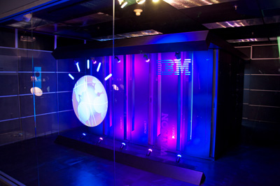
But all of it was just icing on the cake. The audience was not there to see me make a fool of myself (though perhaps a few co-workers were). We were there to discuss the practical, socially-relevant applications of Watson’s natural-language processing in fields directly benefiting humanity.
Healthcare is a primary focus. It isn’t a huge leap to see a patient’s own description of what ails him or her as the (vague, weakly-indicating) clue in Jeopardy. Run the matching algorithm against the huge corpus of medical literature and you have a diagnostic aid. This is especially useful in that Watson could provide the physician its confidence level and the logical chain of “evidence” that it used to arrive at the possible diagnoses. Work to create a “Doctor” Watson is well underway.
As interesting to my colleagues and I are applications of Watson to social services, education, and city management. Imagine setting Watson to work on the huge database of past 311 service call requests. We could potentially move beyond interesting visualizations and correlations to more efficient ways to deploy resources. This isn’t about replacing call centers but about enabling them to view 311 requests — a kind of massive, hyperlocal index of what a city cares about — as an interconnected system of causes and effects. And that’s merely the application most interesting to me. There are dozens of areas to apply Watson, immediately.
The cover story of The Atlantic this month, Mind vs. Machine, is all about humanity’s half-century attempt to create a computer that would pass the Turing Test — which would, in other words, be able to pass itself off as a human, convincingly. (We’re not there yet, though we’ve come tantalizingly close.) Watson does not pass the Turing test, for all sorts of reasons, but the truth is that what we’ve learned from it — what I learned personally in a single round of Jeopardy — is that the closer we get to creating human-like intelligence in a machine, the more finely-nuanced our understanding of our own cognitive faculties becomes. The last mile to true AI will be the most difficult, primarily because we’re simultaneously trying to crack a technical problem and figure out what, in the end, makes human intelligence human.
Where’s the map view for my calendar?
Over the holidays, after the deadline for online shipment had passed, I scampered about buying gifts in the real world. Department store staff, clueless bag-laden tourists, hateful too-loud Christmas tunes — it was all misery. But one particular misery seemed avoidable to me: there was no easy way to have a consolidated view of my schedule of shopping stops overlaid on a map. In other words, why if all my calendar events have a place associated with them could I not have a map view of my schedule?
Google has my calendar and obviously they have maps, so where’s the love? Likewise my iPhone. Of course, an app developer has thought of this. Sorta. Arrive will take your calendar events and give you the one-click ability to view an event individually on a map (assuming you’ve loaded anything into the location field.) But one-at-a-time viewing of events on a map really prevents the kind of route optimization that I envision.
The other instance where such a feature would be useful is when traveling — that is, when physical location and distance are less known to the person. It’s hard to plan a day when you don’t know where things are. It was in this situation last week in DC that I tweeted my dismay that such a feature or app did not exist.
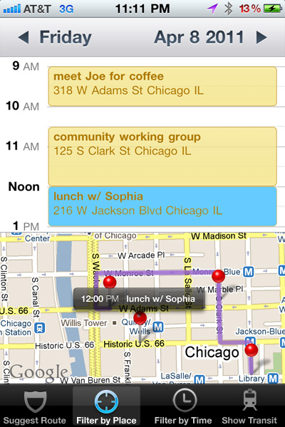
So I mocked something up. Really it is just a mashup of the iPhone calendar and map views, but the power of such a feature comes from the route suggestion and ways of filtering. Certainly one should be able to filter by calendar (i.e., show me only work items) or by time (i.e. constrain to 1-4pm today). The more powerful direction would be to constrain a time period’s locations to essentially rearrange your appointments within a given physical radius.
The most powerful function — one that already exists, just not in an integrated way — is to have the system optimize your route for you, suggesting potential reschedules or changes of venue to best fit a day together. Obviously there’s optimization that could happen to reduce transit time, but you could imagine forcing it to show you routes that were most or least walkable (ala Walkscore) or, as Google just recently added, routes that use public transit but minimize your time waiting outside.
The real power here would come from being able to add calendar events directly from the map view — and vice versa. Ideally there’d be no switching out to either standalone app. Or, it could be just another view in the calendar itself: day, week, month, list, map.
Ultimately this is a very specific example of how application developers use old, often physical organizational metaphors (calendars, maps) that silo activities rather than working across data to get at what people are trying to accomplish in the first place. And it isn’t just application developers. Substitute product designers, architects, urban planners, or just about any other design profession and you’ll be able to think of similar instances.
OK, then. Time to build this.
Ambient informatics through the rearview mirror
In 1998 I was nearing completion of the grad program at Georgia Tech in Information Design and Technology (now called Digital Media), cutting my teeth in the theory and practice that I use to this day. But some of it, like the project below for a course in Human-Computer Interaction taught by Greg Abowd (basically this class), only seems really meaningful nearly 12 years on.
Sonopticon was a team project to build a prototype of an automobile-based ambient sensing and heads-up display. We didn’t have to build a car that knew its surroundings — this was HCI, after all — but we did have to explore the issues of what it would be like from a driver’s perspective.
My wife and I took the car out one day (this is how you do anything in Atlanta) and filmed scenarios for later editing in After Effects. The RealVideo files (!) are gone, but some screenshots still exist, which I have strung together below. It’s laughable, really, the quality and overlays, but it conveys some interesting concepts that only now are becoming technically feasible. If the city of data really is coming into being, this is part of it.
And just because I’m channeling 1998 I’m gonna lay this out in one big honkin’ table. Take that CSS absolute positioning! (Best viewed in Netscape 3.0.)
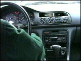 Ignition |
 Sonopticon activated |
 Mirror check |
 Caution avoidance alert |
 Entering I-85 |
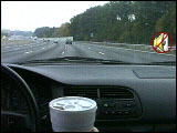 Active Noise Cancellation |
 Emergency vehicle detected |
 Visual confirmation |
 Vehicle passes |
 Upcoming construction |
 Blind spot check |
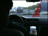 Vehicle moves into blind spot |
 Visual confirmation |
 A satisfied user |
What’s funny to me all these years on is how my focus has shifted so decidedly away from augmenting the automobile to enabling an infomatics of the human-scale city, pretty much the opposite of what the car has done to our metro regions. Though I suppose making cars more aware of their surroundings is the one step towards this vision.
The full project write-up is here, if you are so inclined. I think we got an A.
(By the way, the car used in this demo is the one-and-only MySweetRide.)
The cost of my current
This will shock no one given my lifestyle data obsession and current work focus, but I am now monitoring our home energy usage (and cost) in real time.
Back in April I noted in a harmless tweet what seemed to be far more attention to home power monitoring solutions in the UK than in the US. This prompted my excellent colleagues at IBM Hursley to try to help me out. The geeks at Hursley had for a while been playing around with the data outputs of monitoring hardware made by Current Cost. They saw my tweet, knew that Current Cost had modified some of their gizmos for US usage, and arranged to send me one.
I have bad luck with electrical home projects and I feared this one quite a lot given that I’d have to fuss with the house mains, but the installation proved remarkably easy. True, there are (as yet) no US-specific FAQs or video tutorials, but the idea was straightforward: find the mains and put the clamps over them.
In most of the UK this means locating the circuit breaker/meter combo which is located outside the house. In the US, only the meter is outside the home (due to the outdated practice of having electrical company employees drop by to read it). Yet, that’s where I started. And almost ended. The meter is sheathed in metal for obvious reasons and there didn’t seem to be any easy way in without a blowtorch. Live wires I figured I could handle; molten metal and live wires, no.
So back inside to dismantle the circuit breaker. And there they were. Three big cables: two mains, plus a ground (at the very top of the photo).
You don’t mess with wiring at all, actually. Just gently place the clamps right on the insulated lines. The clamps lead to a battery-powered transmitter box. I bolted the breaker back up and that was that. Once I plugged in the receiver I was immediately receiving real-time data and cost for electricity usage.
In the image above you see that the display shows two power feeds (one per main) in the upper left and that it has a firm connection to the transmitter (upper right). You always have a current energy usage readout (2.8KW). The cost cycles between at-the-moment and per month. The display is rounded out with historical data, time, and temp. (Here’s an annotated version.)
At a glance the data seems dead-on compared to our monthly electricity bills. And it is true that the current usage/cost changes merely by switching lights off and on around the house. It is definitely real-time. But the real value of the system comes in the ability to hook the monitor to your computer. Once that link is established there’s a whole set of services you can plug into.
I use the Current Cost to Pachube app to send my data to the feed aggregator/visualizer service Pachube. Once there you can view the three data feeds — temperature and wattage for the two mains — over time. (The y axis is power in kilowatts.)
The week after I installed the unit we took a bit of a vacation so we were afforded the experiment of observing the house while we were not living in it. Obviously usage was way down (especially since we essentially shut off the AC), but the very quietness of the electricity usage surfaced interesting patterns in home energy consumption unprompted by human need. The graphs were mostly flatlines with regular, periodic low plateaus — obviously something was kicking in on a regular interval. We’re pretty sure one of these is the refrigerator/ice-maker, but there’s one on the other main that we’ve not been able to sleuth just yet. Has to be something with a motor, we think.
We asked our housekeeper to come while we were out — and of course knew precisely when she was there because the graph spiked (vacuum cleaner!). But the next day the graph spiked at roughly the same time and in the same way. Turns out she left early the first day and came back to finish the second (since we weren’t there). So there it is: personal energy monitoring can also help you nab squatters and spy on your home help.
Because Pachube is really a service for mixing various sets of data (ala ManyEyes) you can nearly instantly see your home’s energy usage plotted as CO2 output. And there’s a great iPhone app for viewing your Pachube feeds.
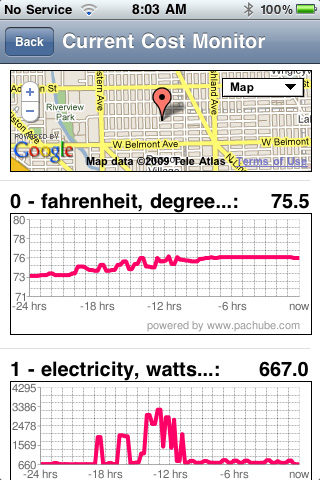
So there are two reasons to care about any of this and both relate to increasing awareness of one’s own consumption patterns (something I wrote about extensively after my stint in Africa). First is cost savings. When you have in-your-face evidence of the impact of turning down the AC or switching off the lights, you are more inclined to do it. (To say nothing of using the monitor to track down energy sucks you didn’t know you had.)
Second is that the idea of instrumenting part of one’s consumption opens up all kinds of possibilities for how we might as a planet solve larger problems. Few would argue that we need smarter power grids. Bills that reflected actual usage (rather than estimated or aggregate) would prompt even great attention to personal usage. Widespread adoption of home monitoring like Current Cost — and the sharing of anonymous data — would show utilities and local governments patterns of usage that could inform smarter maintenance, more flexible infrastructure build-out, and even “competitive” incentive programs between localities.
Last year I used WattzOn to calculate a rough personal footprint. It was atrocious. Sure I commute to work by public transportation or bike, but my international air travel shoved my impact off the charts. This year my travel is very different — lots of small trips, none international. So I recalculated my CO2 and, no surprise, housing is the number one contributor. (And that’s just the house and the power/materials it uses. The Stuff category in the chart below largely deals with our home’s appliances.)
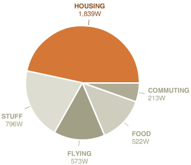
My goal is modest. I’ve like to bring the combined housing and stuff number down by 25% in twelve months. Not sure if that’s possible with the three kids, but they do like the idea of real-time feedback for their actions (rather than, say, a parent praising them merely for turning off the lights in their rooms).
In the end, beyond the sheer nerd factor of monitoring your own energy, what good is it if you don’t use the new information to effect change?
Be like Ada
Today is international Ada Lovelace Day. Don’t know who Ada Lovelace was? Well, that’s part of the problem.
See, a while back I pledged to post on this day about a woman in technology who I admire. The pledge is part of a campaign to raise the profile of women’s contributions to the field. More importantly to me is the collective effort to define role models for young women considering a career in high tech — and who are likely daunted by the overwhelming gender discrepancy therein. It’s astonishing, really, considering how limitless the field is and how generally egalitarian the overall vibe is of the tech scene. But you don’t need charts and surveys to know that things are out of whack. Just get yourself to a tech conference. It’s a sausage fest.
I’ve had the luck of working with dozens of talented women in my decade-plus of employment at IBM and my generally geeky wanderings have given me the privilege of meeting many more.
But today I want to tell you about Jennifer Martin. Jen’s a Creative Director in the Chicago Center for Solution Innovation in IBM. I’ve worked with her for most of the last eight years. Her title belies her unique skills in information architecture and user interaction design. Jen is an expert in bridging the gap between end-user requirements, usability, and design that can be easily translated into a coded thing.
If you’ve ever wondered where the magic happens between an idea and a piece of code, it is with the information architecture — and Jen is a magician of the highest order. Except that it isn’t sorcery. Far from it: IA, as it is called, is wickedly difficult to do well because the devil is most certainly in the details. That page with boxes and arrows on it might look like it represents how you think your app will work, but hand it to a developer who needs to code for every eventuality or hand it to a graphic designer who needs to know what functions really do and nine times out of ten it will be back to the drawing board.
Not with Jen. She’s fluent in the language of both user needs and developer requirements — a false distinction I’m perpetuating even by writing it that way. Design is design and when you get it right it is mostly incontrovertible. Jen gets it right. (And she’s got her priorities in line too.)
Don’t believe me? Have a look at a few of the projects I’ve worked on with her. Eternal Egypt, a challenge to design a seamless experience across a website, PDA’s, mobile phones, and a standalone kiosk. Or, The Forbidden City: Beyond Space and Time, truly the bleeding edge of information design as Jen took to designing an experience in a custom, multi-user virtual world for the Palace Museum in Beijing. I’ll stop there not for lack of other examples or to mitigate Jen’s embarrassment at this post, but because in a way this isn’t the point at all.
Jen Martin is just an example herself. She doesn’t design circuits (though there are plenty of women who do). She’s not a stereotypical geek or the female caricature portrayed in so man male-designed games. She’s just someone who had talent, chose a very high-technology field underserved by that talent, and made a name for herself. We need more like her. Many, many more.
So girls — or ladies, if you’re considering a career change (and who isn’t during this economic apocalypse?) — know that you’ll be in good company if technology interests you. And remember that the popular image of the pocket-protecter wearing man in ill-fitting clothes is just an image. Like any stereotype, it can be erased. You have the undo.
iPhone apps and Flickr nit-picking
The iPhone 3G and firmware 2.0 were released hours after my plane departed for Africa. It was source of great consternation for me, but it did force a kind of critical distance that I rarely have from new technology releases. What did I learn? I learned that I don’t care for critical distance from new technology releases.
I did eventually get to update the firmware on my original iPhone while I was over there, though there was virtually nothing I could do with new apps without good network access. Read: all the battery-sucking issues, none of the benefits. Since I have been back I’ve gotten a 3G, ceding the original phone to my wife who really needed it.
Here’s a list of apps that I’m liking a great deal.
- AirMe – Takes photos and uploads them automatically to Flickr with geo info (and weather tags, if you want). Works with Facebook too. Here’s a sample photo.
- Last.fm – Last.fm has always been great, but conceptually is so well-suited to a mobile device. No background apps on the iPhone means it won’t play while you do other stuff (ala the iPod), but them’s the breaks with Apple.
- MLB.com At Bat – Recently updated to include field and batter infographic overviews. Very well-designed and pretty timely video clip access make this indispensable, even when you’re at the game (especially so at Jumbotron-less Wrigley).
- Remote – Possibly the most useful app out there, which is probably why Apple got to it first. Creates a slick remote interface for iTunes and Apple TV’s on your LAN.
- Rotary Dialer – Because you can, that’s why.
- Shazam – Too-good-to-be-true app that identifies the title and artist of a currently-playing music source (like the jukebox at a bar). Pretty damn accurate and it offers instant links to buy the track. Great party trick potential trying to stump it.
- Simplify Media – Sets up a server on your machine that allows streaming access to your iTunes library wherever you (or anyone you permit) happen to be. This was cool when it was computer-to-computer, but the ability to stream anything from home to your iPhone is game-changing. Points to a day when the iPod has no storage at all and is just a thin network interface to your cloud of media. Highly recommended.
- Tetris – Slower to start than the free knock-off (now removed) Tris, but still mesmerizingly addictive. Takes a while to get used to manipulating blocks by finger flick.
- Twitterific – Not sure I’d even use Twitter if not for the desktop app Twitterific. The iPhone version is just as scrumptious, adding in some location features to boot.
There are a few apps I want to like, but just don’t. NetNewsWire is everything I want in an offline feedreader (with desktop and web synching!), but it is just dog-slow. Takes forever to load my feeds. AIM works fine, but instant messaging just doesn’t work with the no background app paradigm. You can’t give all your focus to chat.
And here are the apps I wish existed.
Backpack – I know 37Signals is all about lightweight web apps, but what I would love is actual offline access with synch.
SMS over IP – We can make phone calls with VOIP, but why not SMS? This may exist and I don’t know it, but with AT&T’s ridiculous messaging fees, why put anything over the voice network you don’t have to?
MarsEdit – On-the-go blog composition. Synching with desktop drafts would be yummy.
A native NPR app.
Google Earth – Why not? The video capabilities are clearly adequate and with the iPhone location abilities seems like a natural.
A great e-reader app. Kindle-screen quality with iTunes store breadth of access? Sign me up.
A stickie note app that synchs at least to a desktop app, preferably to a web app too. Most text pad apps for iPhone do too little (see all the to do list apps in the App Store) or too much (like Evernote, which I tried desperately to like). All I need is stickie notes. ShifD is promising, but right now you can only get it on your phone as a web app. Not ideal at all. If you know of something along these lines, please let me know!
———-
In other news, I’ve been using Flickr a ton lately. The more I use Flickr the more I love it, but it has prompted some critical observations:
- Video on Flickr is fantastic, but none of the video metadata comes over. This may not be Flickr’s fault, but it breaks the videos-are-just-long-photos thing organizationally.
- There is a “Replace this photo” option for stills that is very handy when uploading high-res versions of low-res originals. But this function does not exist for video. You have to delete and re-upload, losing all metadata and comments. Boo.
- Speaking of replacing, it would be great if there were a bulk replace function. Having to do it photo by photo is so … unFlickr.
- Flickr slideshows do not include video. C’mon!
- FlickrExport for iPhoto is indispensable, but it does not allow permission-setting (CC, etc). This is a very correctible limitation, it seems to me. (There’s a Facebook export from iPhoto that works just as smoothly).
- Speaking of iPhoto, why will it not copy video seen from a shared library like it will photos? Annoying!
Phew. Feels good to release some geek.
A workshop on high performance computing in the humanities
A few years back I mused, where are the humanities applications for supercomputing? Well, we’re going to try to answer that.
Announcing a special one-day workshop to brainstorm uses of high performance computing in arts, culture, and the humanities. If this is your thing, please consider attending and/or passing it on.
A Workshop on Humanities Applications for the World Community Grid
On October 6, 2008, IBM will be sponsoring a free one-day workshop in Washington, DC on high performance computing for humanities and social science research.
This workshop is aimed at digital humanities scholars, computer scientists working on humanities applications, library information professionals, and others who are involved in humanities and social science research using large digital datasets. The session will be hosted by IBM computer scientists who will conduct a hands-on session describing how high performance computing systems like IBM’s World Community Grid can be used for humanities research.
The workshop is intended to be much more than just a high-level introduction. There will be numerous technical demonstrations and opportunities for participants to discuss potential HPC projects. Topics will include: how to parallelize your code; useful tools and utilities; data storage and access; and a technical overview of the World Community Grid architecture.
Brett Bobley and Peter Losin from the Office of Digital Humanities at the National Endowment for the Humanities have been invited to discuss some of the NEH’s grant opportunities for humanities projects involving high performance computing.
If attendees are already involved in projects that involve heavy computation, they are encouraged to bring sample code, data, and outputs so that they can speak with IBM scientists about potential next steps for taking advantage of high performance computing. While the demonstrations will be using the World Community Grid, our hope is that attendees will learn valuable information that could also be applied to other HPC platforms.
The workshop will be held from 10 AM – 3 PM on October 6, 2008 at the IBM Institute for Electronic Government at 1301 K Street, NW, Washington, DC. To register, please contact Sherry Swick. Available spaces will be filled on a first-come, first served basis.
Honesty in application design
We’re a few months into the painstakingly slow process of home video conversion and upload. Many tools have come into play, but the most useful has been VisualHub. It’s batch operation, Xgrid support, and variety of device destination presets make the fact that it is free that much more amazing.
Last night I gave it a whopper of a batch list to get crunching on. When I went to bed it had some ridiculous estimate of time to complete, several thousand hours, constantly recalculating up and down.
But when I woke, this.

I love it. Is it a lie or is it honesty? I’d much rather have an app say, “You know what, I can’t do this. I have no freaking idea how long this is going to take” than flop around trying to calculate the incalculable.
Back to basics
Two of my resolutions for this year were to simplify things and to run more. These are, in fact, the same thing.
The past several years I’ve been doing one or more triathlons a summer. Good fun for sure and a great workout, but logistically complex. I mean, I’m all for gear and equipment — it is, I believe, one of the reasons I wanted children — but needing a place to swim and the multi-hour stretches of time required to bike had become a bit onerous, especially when traveling. So simplifying for me was running: the perfect, low-tech, do-anywhere workout.
But I’m still a sucker for exercise gadgets. (No, not that kind.) I used to run with a Garmin Forerunner GPS. It was bulky and didn’t monitor heart rate, so of course I wore a second watch that did do that. Wearing two watches (and an MP3 player) while running was a level of dorkdom I didn’t think I could achieve, but achieve I did. And playing with GPS allowed me to do nutty things like using the city as a giant Etch-a-Sketch. Unfortunately neither device played well with the Mac so all this wonderful data I was collecting couldn’t be manipulated easily.
Right around this time Nike and Apple introduced the Nike+iPod gadget, basically a wireless pedometer that logs distance and pace to the iPod nano as you run. I ditched the GPS watch (which incidentally don’t work so good in awful weather or in weird places like Lower Wacker). The integration with an online tool and ease of just plugging in your iPod after a workout was a perfect solution, all-Flash interface on the Nike site notwithstanding. (Only real gripe: it is made to work with Nike shoes, which I loathe. But that was easily solved with a knife.)
So, it seems that Nike/Apple are rolling out an upgrade to the service. There doesn’t seem to be a hardware change, but they’re branching out from just running. Apparently Nike is “in talks” with gyms and equipment manufacturers to allow the nano to plug directly into treadmills, ellipticals, stair climbers, and stationary bikes. So, basically, the piezo sensor in the shoe is bypassed and data from the workout is sent directly from the machine to the nano. That’s fine, except that in the past when I have run on a treadmill with the current kit I find that the pedometer does not agree with the treadmill distance. (After an 8 mile run the treadmill was off by nearly 3/4 of a mile.) Clearly there will be discrepancies for people who run both outside and inside.
The strangest thing about the announcement is that Nike has developed a new, common workout “unit” called a CardioMile. My guess is that this enables users to “compete” against each other regardless of their preferred machine. But it does seem odd. I mean, mileage is mileage. If you and I are in a competition the person who runs furtherest (or fastest) first wins. But if I use the elliptical for 45 minutes have I “beaten” a person who was on the treadmill for 30? Kinda bizarre.
How it will actually work is another matter entirely. Will it be a retrofit for existing exercise equipment or brand new machines? If the latter that’s a hell of a lot of stuff to replace because a few geeks want to plug in their iPods. Will the headphone connectors commonplace on workout equipment today now route audio from your iPod? Does the gym have to provide tech support?
Early this year I looked at a new gym right by my work. They had spanking new treadmills that did allow iPod hookups. Not for workout data, of course, but it seemed promising since there was a large screen embedded in the treadmill too. Excellent, I can watch video straight from my iPod! But … no. Not only were video functions inoperable, but all it really did was replace your iPod controls with a touchscreen interface for the same controls. Essentially useless. Or rather, no functionality beyond what you could get without hooking your iPod up. (One wonders if the treadmill is the new office desk.)
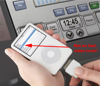
More promising was a USB port on the treadmill display. OK, now we’re talking! Save your workout data (generated from the treadmill) straight to the memory stick. Well, it didn’t work. I tried multiple USB keys, multiple treadmills over many days. Never did work. Inquiries to staff were met with blank stares and general dumbfoundity. It went something like this.
“Hi there. Really loving the new treadmills, thanks. I was wondering if you could help me figure out how to use the USB saving function.”
” … “
“You know, the new thing … where you can plug in this [waves USB key] and save your run data?”
” … “
“OK, do you have a manual maybe? Something I can look at?”
“Did you want to sign up for pilates?”
And this is why I think the whole Nike+iPod machine integration thing might be doomed. Gyms will need tech support. Now, I’m not saying there aren’t a lot of fitness-obsessed geeks or tech-savvy meatheads, but the Venn diagram of hardware debugger vs. personal trainer for your typical club probably has a very tiny circle at its center. I just don’t see this sort of thing taking off. Which may be why the press release is on Nike’s site, not Apple’s.
So, I go basic. Or as basic as I can still swaddled in the loving embrace of technology. Just running, just outside. We’ve quit our club. The city is now our gym. I’m signed up for a beautiful 10 mile race in April — my first in many years (and with my wife, who can run further than I can these days). And I’m considering a multi-leg 200 mile relay from Madison to Chicago. Not sure I can take the on-again, off-again but the prospect of running in the dead of night does hold a certain perverse charm.
By the way, I’m still looking for a unified, standardized format for workout data. Microformats anyone?
Good Apple, bad Apple
Lots of Apple news since Macworld in January. Figured I’d weigh in for those of you who look exclusively to me for technology guidance. (Tip: bad idea.)
In a very un-Apple-like move they provided significant software-based functionality upgrades to two existing products — the iPhone and the Apple TV — at no cost to owners. Now, I know that iPod touch owners bitched about having to pay $20 to make their units phone-less iPhones, but I have no sympathy for that. If you really wanted the extra functionality when you bought the touch you should have just bought an iPhone.
The new location-awareness functionality on the iPhone is jaw-dropping, not only in its accuracy but in the fact that it was software-only (no GPS) and cleverly uses cell tower and WIFI triangulation to figure out your location. It is like getting a whole new device for free. LOVE it.
But … where oh where is the iPhone SDK? I think pretty much everyone is tired of web-based apps that try to do things that a native, Cocoa app was clearly meant to. C’mon, Apple!
Today the Apple TV upgrade rolled out. Pretty much what Jobs announced — HD video, redesigned interface, rentals — but there is one feature no one talked about and it, too, is like getting a new device. The Apple TV now acts exactly like an Airport Express, showing up in network-connected iTunes in your home as just another set of speakers. Not only that, but the connection is two-way (unlike the Airport Express). That is, changes you make at the Apple TV by remote flow back to iTunes. Superb! Now my Airport Express is superfluous. Might have to stow that in my travel bag for hotel room rocking-out. (PVRblog has great coverage of the new stuff.)
But … the movie rentals. Apple, thank you for high-def, thank you for 5.1 audio, but what the hell were you thinking limiting movie playback to a 24 hour period? Do none of you have children? Have none of you travelled overseas before? I rarely watch a movie in a single 24 hour period. That’s just asinine. Please tell me this is just more movie studio idiocy (like DRM) and that you didn’t actually think this was a good idea.
Leopard: QuickLook may be the best thing in OSX in the last three major revs. Seriously. Has changed the way I work. Time Machine, well the jury is still out. I’ve not needed it (he says as his hard drive armature plows a furrow into the disk platter.)
But … Spaces? Useless to me. And if I initiate it one more time by dragging a window to the screen edge accidentally I am going to scream. Stacks? Totally useless. If someone can show me how this is any way more usable than a flat depiction of filesystem hierarchy I would be willing to buy you a tasty beverage.
MacBook Air: sexy, awesome. Love the lack of CD/DVD drive.
But … would this really last five minutes in a house with mischievous children? No, it would not.
And lastly, where praytell are the new MacBook Pros? Gotta have some of that Air multitouch trackpad goodness!


